")
Transform Your Space with Perfect Color Harmony (Expert Methods)
Transform any space into a designer’s dream by mastering the art of creating a cohesive color scheme. Start with a single inspiration piece—whether it’s a beloved painting, textile, or natural element—and extract its dominant colors using digital color picker tools. Build your palette around the 60-30-10 rule: 60% dominant color for walls and large surfaces, 30% secondary color for furniture and textiles, and 10% accent color for accessories and artistic elements. Test your chosen colors in different lighting conditions throughout the day using large paint swatches or fabric samples before making final decisions. Connect spaces seamlessly by selecting one unifying neutral shade that flows through your entire home, then layer each room’s unique accent colors within this foundation. This strategic approach creates visual harmony while allowing for creative expression in every space.
Understanding Color Theory Basics
Primary, Secondary, and Tertiary Colors
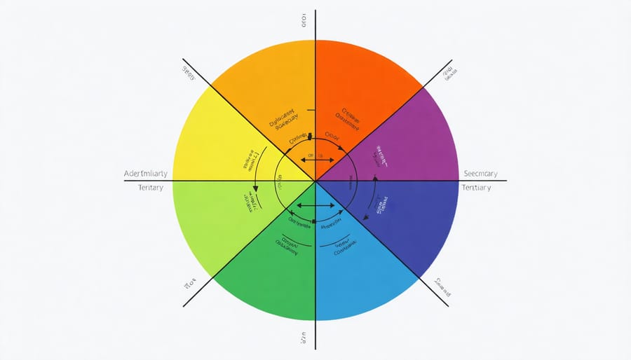
Understanding color relationships is fundamental to achieving harmony in interior design. Let’s start with the basics: primary colors are red, blue, and yellow – the building blocks from which all other colors are created. When you mix two primary colors, you get secondary colors: green (blue + yellow), purple (red + blue), and orange (red + yellow).
Tertiary colors emerge when you combine a primary color with an adjacent secondary color on the color wheel. These include yellow-green, blue-green, blue-purple, red-purple, red-orange, and yellow-orange. Think of these as the “in-between” shades that add depth and sophistication to your color scheme.
Understanding these relationships helps you create balanced combinations. For example, if you’re working with a bold primary color like blue, you might soften it with tertiary blue-green accents. Or, you could create dynamic contrast by pairing a secondary color with its complementary primary color, like purple with yellow. This knowledge forms the foundation for more advanced color combinations and ensures your space feels intentionally designed rather than randomly assembled.
Warm vs. Cool Colors
Color temperature plays a crucial role in setting the mood and atmosphere of any space. Warm colors, like reds, oranges, and yellows, create an inviting, cozy environment that’s perfect for social areas like living rooms and dining spaces. These hues remind us of sunlight and fire, making rooms feel more intimate and energetic.
On the flip side, cool colors such as blues, greens, and purples evoke feelings of calmness and serenity, similar to water or a forest landscape. They’re excellent choices for bedrooms and bathrooms where relaxation is key. Cool tones can also make a space feel larger and more open, while warm colors tend to make rooms feel more compact and contained.
When planning your color palette, consider the room’s purpose and the atmosphere you want to create. A home office might benefit from a mix of warm and cool tones – perhaps cool walls for focus with warm accents for energy. Remember that you can use temperature contrast to create visual interest; pairing warm and cool colors can add depth and dimension to your space while maintaining harmony in your overall design scheme.
Professional Methods for Building Your Palette
The 60-30-10 Rule
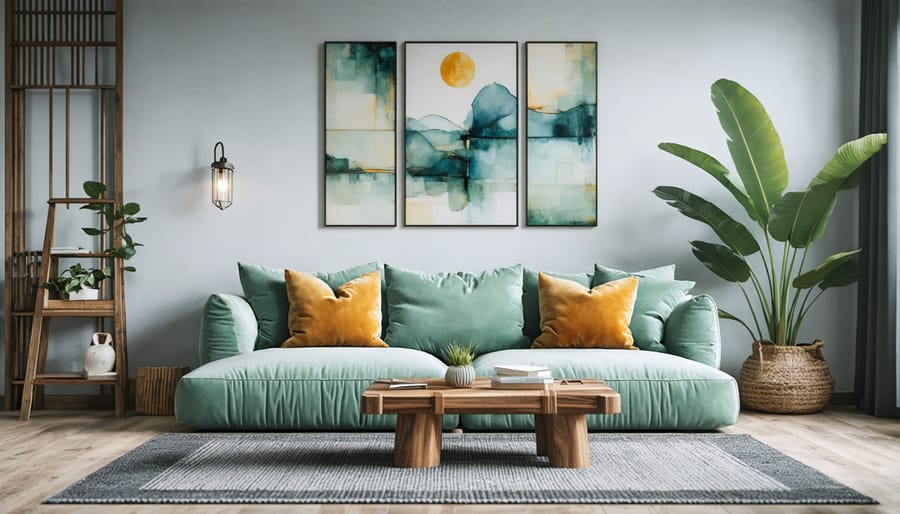
The 60-30-10 rule is a designer’s secret weapon for creating perfectly balanced color schemes that feel both professional and visually appealing. This time-tested formula helps you distribute colors in a space with confidence, taking the guesswork out of color coordination.
Here’s how it works: Use your dominant color for 60% of the space, your secondary color for 30%, and your accent color for the remaining 10%. Your dominant color typically covers the walls and large furniture pieces, creating a solid foundation. The secondary color appears in window treatments, accent furniture, or bedding, while the accent color adds pop through accessories, artwork, or small decor items.
For example, in a living room, you might use a warm gray for 60% (walls and sofa), navy blue for 30% (curtains and armchairs), and golden yellow for 10% (throw pillows and decorative vases). This distribution creates visual harmony while maintaining interest through controlled contrast.
The beauty of this rule lies in its versatility. Whether you’re working with bold, vibrant colors or subtle, neutral tones, the 60-30-10 principle ensures your space feels cohesive rather than chaotic. It’s particularly effective in open-concept spaces where maintaining color flow between areas is crucial.
Remember, while this rule serves as an excellent starting point, you can adjust the percentages slightly to suit your specific needs and preferences.
Starting with Inspiration Pieces
One of the most natural ways to develop a color palette is to draw inspiration from pieces you already love and own. Start by identifying a favorite piece of furniture, artwork, or textile in your space – perhaps a Persian rug, a striking piece of wall art, or even a beloved throw pillow. This anchor piece will serve as your foundation for building a cohesive palette.
Look closely at your inspiration piece and identify 3-4 distinct colors within it. For example, if you’re working with a floral painting, you might notice sage green leaves, coral pink petals, cream backgrounds, and touches of golden yellow. These colors already work together harmoniously in your piece, making them perfect candidates for your room’s palette.
Use your smartphone to take a clear photo of your inspiration piece in natural light. Many color palette apps can analyze the image and extract the exact colors, providing you with specific color codes you can use when shopping for paint, fabrics, or decor items. This technology ensures you’re matching colors precisely rather than relying on memory.
Remember that you don’t need to use every color from your inspiration piece in equal amounts. Choose one or two dominant colors for larger surfaces like walls, then use the remaining colors as accents through accessories, artwork, or textiles. This approach helps maintain balance while creating visual interest throughout your space.
By starting with a piece you already own and love, you’re ensuring your new color scheme will feel personal and intentional, while taking the guesswork out of color coordination.
Using Color Wheel Relationships
The color wheel is your secret weapon for creating beautiful color combinations that work harmoniously together. Let’s explore three classic relationships that designers swear by.
Complementary colors sit opposite each other on the color wheel, creating bold, eye-catching contrasts. Think blue and orange, or purple and yellow. This scheme works wonderfully for creating focal points in your space, but remember to use one color as the dominant shade and the other as an accent to avoid overwhelming the room.
Analogous schemes use colors that are next to each other on the wheel, like yellow, yellow-green, and green. These create a serene, cohesive look that’s perfect for bedrooms or spaces where you want to promote relaxation. Choose one color to dominate, use a second to support, and the third as an accent for the perfect balance.
Triadic schemes involve three colors equally spaced around the wheel, offering vibrant yet balanced combinations. This arrangement provides high visual contrast while maintaining harmony. For example, using purple, green, and orange creates an energetic palette that’s perfect for creative spaces or children’s rooms. To make this scheme more livable, try using muted versions of these colors or focusing on one primary color with the others as accents.
Testing and Implementing Your Color Scheme
Digital Tools and Resources
Creating the perfect color palette has never been easier, thanks to a variety of digital tools and resources available at your fingertips. Whether you’re planning a room makeover or designing an entire home, these user-friendly applications can help you visualize and refine your color choices.
Adobe Color (formerly Adobe Kuler) stands out as a professional-grade tool that’s surprisingly easy to use. It allows you to create color schemes from uploaded photos or by selecting colors manually. The tool automatically generates harmonious combinations based on color theory principles, making it perfect for both beginners and experts.
Coolors.co offers a unique approach with its color palette generator. Simply press the spacebar to cycle through different color combinations until you find one that speaks to you. You can also lock specific colors and let the generator suggest complementary options, making it ideal for building upon existing room elements.
For paint-specific planning, most major paint manufacturers offer free visualization tools. Benjamin Moore’s Color Portfolio app and Sherwin-Williams’ ColorSnap Visualizer let you virtually paint your rooms using your smartphone camera. These apps are particularly helpful for seeing how colors will look in your actual space under different lighting conditions.
Pinterest remains an invaluable resource for color inspiration, allowing you to create boards of rooms and color combinations you love. The platform’s visual search feature can help you identify specific paint colors from inspiring photos.
For those who prefer a more scientific approach, Pantone’s Color Finder provides precise color matching and professional-grade palettes, though it may require a small subscription fee for full access.
Sample Testing Strategies
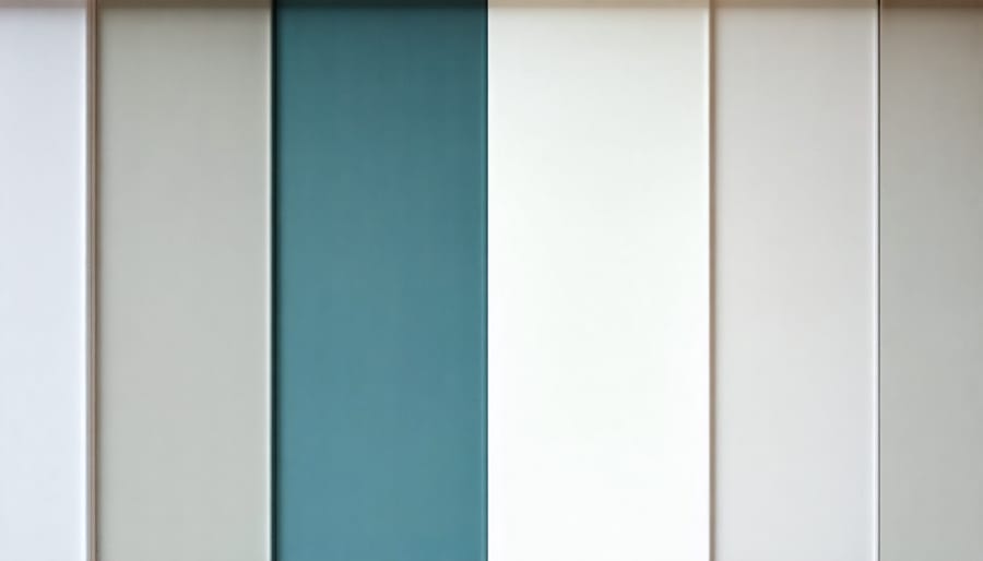
Before committing to a full room makeover, it’s essential to test your chosen colors in your actual space. Start by collecting paint samples or swatches of your selected colors, including any trending paint colors you’re considering. Paint stores typically offer sample-size containers that are perfect for this purpose.
Create large test patches (at least 2×2 feet) on different walls in your room. This allows you to observe how the colors interact with your space’s natural and artificial lighting throughout the day. Remember that colors can appear dramatically different depending on the time and lighting conditions.
For fabric and furniture colors, gather swatches and samples to create a mock layout. Place these samples in the intended location and observe them for at least 48 hours. This gives you time to see how they work with your existing décor and lighting conditions.
Digital testing is another valuable strategy. Take photos of your space and use color visualization apps to virtually “paint” your walls. Many paint manufacturers offer free apps that let you upload room photos and experiment with different colors without touching a paintbrush.
Create a physical mood board with your chosen color samples, including paint chips, fabric swatches, and pictures of furniture or accessories. This helps you visualize how all elements will work together before making any permanent changes. Keep this board in your space for at least a week, allowing time to ensure you’re comfortable with your choices and that they maintain their appeal beyond the initial excitement.
Common Mistakes to Avoid
Creating a beautiful color palette can be tricky, and even experienced designers sometimes fall into common pitfalls. Let’s explore these frequent mistakes and learn how to avoid them for better color harmony in your space.
One of the biggest mistakes is choosing colors based solely on current trends without considering your space’s unique characteristics. While trendy colors can be appealing, they might not work with your existing furniture, lighting, or architecture. Instead, start with your permanent elements and build your palette around them.
Another common error is using too many colors at once. While it’s tempting to incorporate all your favorite hues, using more than 3-4 main colors can make a space feel chaotic and uncoordinated. Stick to a primary color scheme and use additional colors as accents only.
Many people also forget to consider lighting when selecting colors. A paint color that looks perfect in the store might appear completely different under your home’s natural or artificial lighting. Always test colors in your actual space at different times of the day before making final decisions.
Ignoring color temperature is another frequent mistake. Mixing warm and cool tones without intention can create an uncomfortable atmosphere. While combining temperatures can work, it needs to be done purposefully and with balance in mind.
Some decorators fall into the trap of using the exact same color throughout a space. While consistency is important, slight variations in tone and intensity can add depth and interest. Consider using different shades and tints of your chosen colors to create visual dimension.
Lastly, overlooking the psychological impact of colors can lead to spaces that feel uncomfortable or unsuitable for their intended purpose. For example, using energetic reds in a bedroom might not create the calming environment you’re aiming for. Always consider how different colors affect mood and behavior when planning your palette.
Creating a cohesive color palette doesn’t have to be overwhelming. By following the principles we’ve discussed – from understanding color theory to utilizing the 60-30-10 rule and testing samples in your space – you can confidently develop harmonious color schemes that transform your environment. Remember to trust your instincts while keeping basic color relationships in mind, and don’t be afraid to experiment with different combinations until you find the perfect match. Whether you’re using digital tools or traditional color wheels, the key is to start simple and build your confidence gradually. Take that first step today by choosing your base color, and watch as your perfect palette unfolds. With practice and patience, you’ll soon be creating beautiful, balanced color schemes that reflect your personal style and enhance your space’s atmosphere.