7 Interior Design Secrets to Transform Your Home This Weekend
Transform your home with these 7 essential interior design principles that professional designers use to create stunning spaces:
1. Establish a captivating focal point in each room to draw the eye and anchor the design.
2. Embrace the power of color psychology to evoke specific moods and emotions.
3. Create visual balance through the strategic placement of furniture, decor, and architectural elements.
4. Layer textures and patterns to add depth, dimension, and tactile interest to your interiors.
5. Optimize traffic flow and functionality with thoughtful space planning and layout.
6. Illuminate your spaces with a mix of ambient, task, and accent lighting to set the perfect atmosphere.
7. Infuse your personal style and story into the design for a home that truly reflects who you are.
Master these 7 principles and unlock the secrets to crafting magazine-worthy interiors that elevate your everyday living experience.
Balance
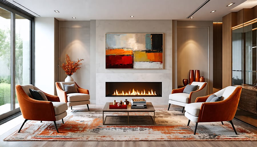
Balance is a fundamental principle in interior design that brings a sense of harmony and stability to a room. It’s all about creating a visually pleasing distribution of elements, whether through symmetry or asymmetry. Symmetrical balance involves arranging identical objects on either side of a central point, like placing two matching armchairs on opposite sides of a fireplace. This creates a formal, orderly look that exudes a feeling of calm and tranquility.
On the other hand, asymmetrical balance is achieved by using different objects of equal visual weight to create equilibrium. For example, you might pair a large sofa with a smaller armchair and an end table to balance out the visual mass. This type of balance tends to feel more dynamic and interesting, perfect for creating cozy home decor ideas with a relaxed vibe.
To achieve a well-balanced room, consider the size, color, and texture of each element. Larger, heavier items should be evenly distributed throughout the space, while smaller objects can be used to fill in gaps and create visual interest. Use color to create balance by distributing shades evenly or using contrasting hues to create focal points. Vary textures to add depth and prevent the room from feeling too uniform.
Remember, balance doesn’t mean everything has to match perfectly. The goal is to create a sense of equilibrium that feels intentional and effortless. Experiment with different arrangements until you find a layout that feels just right for your space.

Rhythm
Rhythm in interior design is all about creating visual interest and movement within a space. Just like in music, rhythm in design involves repeating patterns, progressions, transitions, and contrast to guide the eye through the room and evoke a particular mood or energy.
To incorporate rhythm, start by repeating certain design elements like colors, shapes, textures, or patterns. This repetition establishes a cohesive theme and helps tie the space together. But too much repetition can feel monotonous, so be sure to vary the size, scale, or placement of repeated elements to create progression and keep things interesting.
Transitions are another way to create rhythm by guiding the eye from one area to another. This can be achieved through the strategic placement of furniture, the use of lighting to highlight certain features, or the incorporation of curved lines to soften sharp angles and encourage flow.
Finally, don’t be afraid to introduce contrast to shake up the rhythm and add visual interest. This could mean juxtaposing rough textures with smooth finishes, mixing vintage and modern pieces, or pairing bold colors with neutral tones. The key is to strike a balance and ensure that contrasting elements still work together harmoniously.
Some ideas for applying rhythm in your home decor include using a repeating color scheme throughout the space, incorporating a statement pattern on accent pieces like throw pillows or curtains, or creating a gallery wall with artwork of varying sizes and frames. By thoughtfully combining repetition, progression, transition, and contrast, you can create a space that feels dynamic, engaging, and uniquely yours.

Harmony and Unity
Harmony and unity are two closely related principles that form the foundation of a well-designed space. When a room has harmony, all the elements work together to create a pleasing, balanced whole. Unity takes this a step further, ensuring that the design flows seamlessly from one area to the next. To achieve harmony and unity, designers rely on techniques like color schemes, consistency in style, and repetition of patterns and textures.
Color is a powerful tool for creating harmony. By selecting a cohesive color palette and using it throughout the space, you can tie the various elements together. This doesn’t mean everything has to match perfectly; rather, choose colors that complement each other and evoke the desired mood. Consistency in style is another key aspect. Whether you prefer modern minimalism or cozy farmhouse chic, stick to one overarching style to maintain a sense of unity.
Repetition is also essential for achieving harmony. This can involve repeating certain colors, patterns, or textures throughout the room. For example, if you have a striking geometric pattern on your curtains, consider echoing that shape in your throw pillows or artwork. By repeating these elements, you create a sense of visual continuity that pulls the space together.
Remember, the goal is to create a room that feels cohesive and intentional, where every element works in harmony with the others. By mastering the principles of harmony and unity, you can transform any space into a beautifully designed oasis that welcomes and delights all who enter.
Emphasis
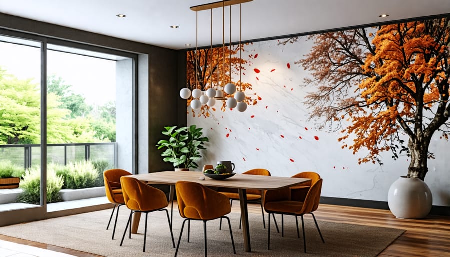
Emphasis, a cornerstone of interior design, is all about creating focal points that draw the eye and command attention. To achieve this, consider incorporating accent walls, statement furniture pieces, or captivating artwork that stands out from the rest of the room. An accent wall in a bold color or intriguing texture can instantly transform a space, while a striking chandelier or unique sculpture can serve as a conversation starter.
When selecting items to emphasize, consider scale, color, and texture. A large, colorful painting can make a powerful statement on a neutral wall, while a plush, oversized armchair can become an inviting focal point in a cozy reading nook. Don’t be afraid to mix and match textures, such as combining a sleek, modern coffee table with a chunky, knit throw blanket for added visual interest.
Lighting also plays a crucial role in creating emphasis. Strategically placed spotlights or pendant lights can highlight key design elements, such as a beautiful white kitchen backsplash or a prized collection of antiques. By directing the eye to these focal points, you can create a sense of depth and dimension in your space.
Remember, the goal is to create a hierarchy of visual interest, not competition between elements. Choose one or two key focal points per room, and let the rest of your design support and enhance those elements. By mastering the art of emphasis, you can elevate your interior design and create spaces that are both beautiful and memorable.

Contrast
Contrast is a powerful tool in interior design that can instantly grab attention and add visual interest to any space. By juxtaposing different colors, shapes, textures, and sizes, you create a dynamic and engaging environment that draws the eye and keeps it moving around the room.
One of the most common ways to incorporate contrast is through color. Pairing light and dark shades, such as black and white or navy and cream, creates a bold statement. Alternatively, you can use complementary colors from opposite sides of the color wheel, like blue and orange or purple and yellow, for a vibrant and energetic look.
Contrasting shapes and lines also add depth and dimension to a room. Consider combining angular and curved furniture pieces or mixing hard and soft textures like metal and velvet. Varying the scale of objects, such as placing a large artwork above a small side table, can further enhance the sense of contrast.
When using contrast in your interior design, it’s important to strike a balance. Too much contrast can feel chaotic and overwhelming, while too little may result in a bland and uninspiring space. A good rule of thumb is to choose one or two focal points to highlight with contrast, such as a statement wall or a bold piece of furniture, and let the rest of the room serve as a neutral backdrop. By using contrast strategically and tastefully, you can create a space that is both visually appealing and personally expressive.
Scale and Proportion
Scale and proportion are crucial elements in creating a harmonious and well-balanced interior. Scale refers to the size of individual design elements in relation to the room, while proportion is about how those elements relate to each other and the space as a whole. When selecting furniture and decor, consider the dimensions of the room and choose pieces that fit comfortably without overwhelming the area. A large, overstuffed sofa may be cozy, but it can make a small living room feel cramped. On the other hand, a tiny coffee table might get lost in a spacious great room.
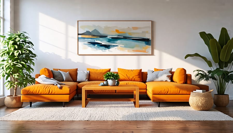
To achieve a sense of balance, mix and match different sizes and shapes while maintaining a consistent overall scale. For example, pair a large sectional with a sleek, low-profile coffee table and add visual interest with accent pieces like table lamps or throw pillows. When in doubt, err on the side of smaller-scale items, as they tend to be more versatile and can be easily rearranged.
Don’t forget about vertical scale, too! Tall bookcases, floor-to-ceiling curtains, and statement light fixtures can draw the eye upward, making a room feel more expansive. Just be sure to balance these elements with grounding pieces like area rugs and low-profile furniture.
Finally, consider the scale of patterns and textures in your design. A bold, large-scale print on an accent wall can make a dramatic statement, while smaller, more intricate patterns work well for textiles like throw blankets and decorative pillows. By carefully considering scale and proportion throughout your design, you’ll create a cohesive, inviting space that feels just right. And if you’re working from home, don’t forget to incorporate stylish desk dividers to define your workspace and maintain a sense of balance.
Details
Small details can make a big impact in interior design. Consider switching out standard hardware on cabinets and drawers for something more unique and eye-catching. Decorative trim, like crown molding or wainscoting, adds character and dimension to walls. Throw pillows in luxurious fabrics and interesting patterns can instantly elevate a sofa or bed. A striking vase filled with fresh flowers or sculptural branches becomes a focal point on a table or shelf. Even stunning stair railing ideas, like intricate ironwork or sleek glass panels, can transform a functional element into a design statement. Curating a collection of meaningful objects, whether vintage finds or handcrafted pieces, adds personality and depth to a space. By paying attention to these small but mighty details, you can take your interior design from ordinary to extraordinary.
Conclusion
By understanding and applying the 7 principles of interior design – unity, balance, contrast, emphasis, proportion, rhythm, and harmony – you now hold the secrets to transforming your home into a beautiful, cohesive space. Whether you’re a homeowner looking to refresh your living room, a DIY enthusiast tackling a bedroom makeover, or a real estate agent staging a property, these principles will guide you in creating interiors that are both visually appealing and functional. So why not start this weekend? Choose a room, keep these principles in mind, and have fun experimenting with colors, textures, and layouts. With a little creativity and these design fundamentals, you can achieve the home of your dreams.
