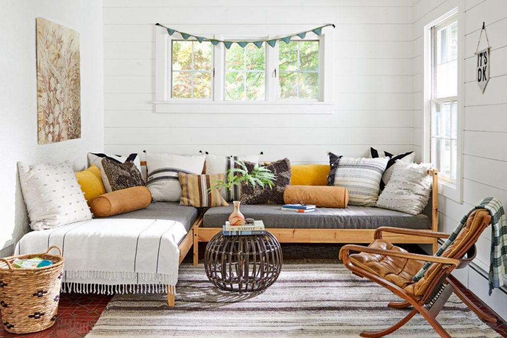
This Refurbished 1926 Tudor Beams with Neutral Colors and Warm Textures
An array of natural fibers and textures enhance this home’s neutral scheme.
Tudor homes, like their moody monarch namesakes, are not particularly popular for being lively and cheery. This is why when Danny and Stephanie Agne bought their 1926 home in Kansas City, Missouri, they already knew that they would keep its sturdy details (lead-glass windows, iron scrollwork) and get rid of its attractive qualities (closed-off spaces, and numerous dark stains).
Stephanie, the owner of Golden & Pine, an interior design outlet, explained that they intended to lighten everything up. To tie up the sitting area, Stephanie used a lush carpet with tassels. Underneath the carpet is a 12-x-15-foot jute rug that extends to the high-traffic perimeter. The couch color gets a nice bounce from the peachy pink throw pillows.
Contrary to popular opinion, neutral does not have to mean bland. Stephanie says that to her, olive is a neutral-like color, like a jacket you wear because it goes with everything.
They enhanced the flow by removing some walls, but one of the most notable moves was painting almost all the rooms white. The couple kept some original details, such as the front door, iron stair railing, and crystal doorknobs. Stephanie used Benjamin Moore Swiss Coffee because of its warm undertones. She says using stark white would have had an overly modern feeling.
Each room was originally painted in different colors with dark floors and millwork, giving it a cramped and outdated look. With the new design, the dining room is airy and bright. There is a varying use of different tones and textures of natural wood all around the house. The chandelier was the perfect piece to tie up the carefree but classy dining room look.
